SmartPark

An intuitive solution to simplify paying for parking

Role Sole product designer

tools Adobe Illustrator, Figma, Google Forms,  Miro

disclosure This project was created purely to demonstrate my skills and knowledge in the field, without any connection to a real company or product.

introducing

SmartPark

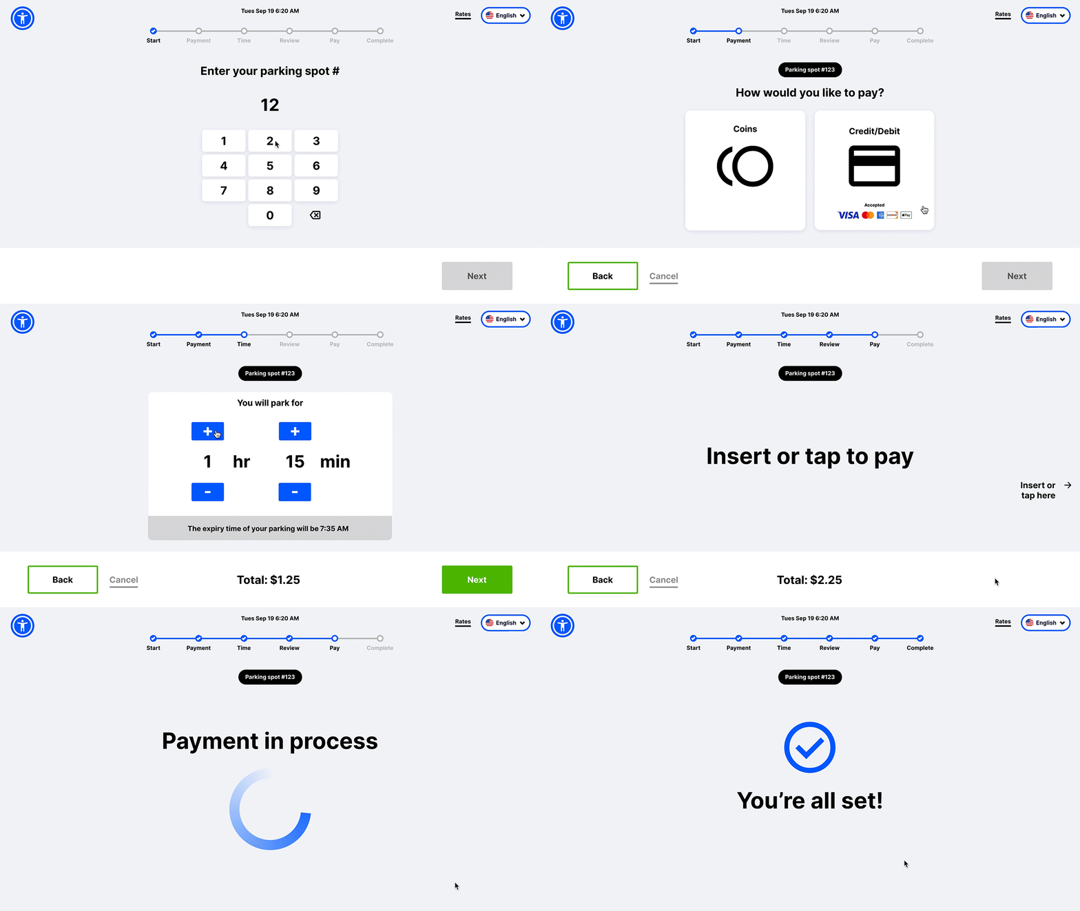
SmartPark is a redesigned parking meter application that revolutionizes the way you pay for parking by using a reimagined touch screen, unlike traditional parking meters, and an easy-to-follow process driven by basic UX principles, user feedback, and user testing.

background

How it started.

For as long as I've lived on Long Island, a tiny fish-shaped island just east of New York City, I can't recall one pleasant experience at a parking meter. Can anyone? Parking meters have always been the bane of my existence, and I'm sure many others would say the same. The problem stemmed from the design-flawed user interface and overall structure.

define Problem

Locals don't have an easy way to pay for parking because the existing parking meter is difficult to use and time-consuming.

Individuals spent time grappling with the process of operating the haphazardly designed parking meter.

Paying with coins

1. Enter space number > 2. Press green button > 3. Insert coins > 4. Input duration > 5. Take receipt

Paying with card

1. Enter space number > 2. Press green button > 3. Insert card > 4. Input duration > 5. Take receipt

Define Goal

Allow locals to easily pay for parking, shortening the amount of time it typically takes and streamlining the process.

The Town of Islip community needs a solution that incorporates a user-friendly interface that makes paying for parking seamless.

research

20 local residents were surveyed.

How bad is this problem really? To gauge users' experiences using the existing parking meters, 20 Town of Islip residents were surveyed.

Here's what I found.

The steps on how to pay for parking are confusing and time-consuming.

When it’s time to pay, users don’t know where to look on the meter to continue.

Entering the amount of time to park is the most difficult step to users.

The parking meter is not useful to non-English speakers.

Most users think an entirely new machine with a touchscreen would be easier to use.

The screen is difficult to see.

3 themes recurred.

Users are unsure how to use the existing parking meter.

Solution: Reduce cognitive load

The existing parking meter is haphazardly designed.

Solution: Grouping related elements to give meaning

The existing parking meter can't be used by everyone.

Solution: Implement accessibility-focused features

ideate

Let's get brainstorming.

The research findings impacted the direction. The sketches evolved into wireframes, which eventually became a low-fidelity prototype.

wireframes

Clarifying the steps

1: Start

B

A

C

D

Solution: Reduce cognitive load

A Centralized touchscreen display with all elements

Solution: Grouping related elements to give meaning

B Progress tracker

Solution: Implement accessibility-focused features

C Accessibility widget

D Option to change language

2: Choose payment

A

Solution: Grouping related elements to give meaning

A Placing text and icons within buttons to signify a call-to-action

3. Set time (w/ coins)*

A

B

Solution: Reduce cognitive load

A Animated element that indicates where to insert coins

Solution: Make it accessible

B Large font size and color contrast in order to maximize visibility

* Noted as being the most difficult step by users

3. Set time (w/ cc)*

A

Solution: Grouping related elements to give meaning

A Placing icons within buttons to signify a call-to-action

* Noted as being the most difficult step by users

4. Pay (w/ cc)

A

Solution: Reduce cognitive load

A Animated element that indicates where to insert or tap

5. Review

A

Solution: Reduce cognitive load

A Provide the parking details for users to ensure that they’re correct

6. Complete

A

Solution: Grouping related elements to give meaning

A Placing text and icons within buttons to signify a call-to-action

testing

How usable is the product so far?

The lo-fi prototype allowed me to explore how a product will function and how a user will move through the flow, without having to design every detail.

usability studies

Test & modify.

By conducting moderated usability studies, I assessed how easy or difficult it was for users to complete the core task, which was to pay for parking. The overall user experience appeared to be sufficient enough to move forward without any massive changes. All the users completed the core task with ease.

My findings were inaccurate.

There was something I was missing. I approached the usability studies with a different mindset. Instead of directly instructing the user to perform a task, I'll make them think about how to perform the task.

Before

“Input a time of 2 hours and 15 minutes to park.”

After

“The time now is 6:20 AM, and you need to leave by 11:50 AM. Input the correct amount of time you need.”

“You have $2.25 to spend. Input the max amount of time you can pay to park.”

Let's improve the user experience.

By changing my approach and allowing users to think through tasks, instead of directing them to perform tasks, I uncovered pain points that drove new improvements.

KPI

45s average time-on-task

Time-on-task increased by 800% from the original usability study, which averaged 5 seconds.

A

B

C

C

insight

Users spent a long time calculating how long they needed to be parked.

The new design lacked helpful elements that could impact users’ desired parking time, such as the current time and rates.

Improvements:

A Current time

B Dynamic display
of expiry time

C Financial elements
(rates & cost)

KPI

100% user error rate

100% of users were unable to input the max parking time available with $2.25, because the total cost wasn’t shown on the screen.

insight

Users lacked awareness around specific details.

The new design lacked helpful elements that could impact users’ desired parking time, such as the current time and rates.

A

A

Types of accepted credit, which is always displayed during any transaction, weren’t shown when the user would pay.

Improvements:

A Accepted credit

A

B

Details, such as the parking spot #, weren’t present on-screen, so the user would never know if they were incorrect. Also, there was no option to revise these details.

Improvements:

A Parking spot #

B Edit option

FinaliDesign ✨